How I designed and shipped a dev-tool website in one week
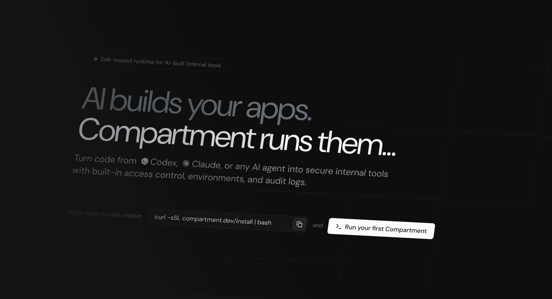
Quick version: a brand-new product needed to meet real users yesterday - to find out whether the hypothesis had legs before anyone spent serious money on it. Minor detail: there was no brand, no design system, and a Webflow setup roughly as flexible as a brick. So I gave myself one week and built the whole thing - brand from scratch, a token-based design system, and Figma, code, and Git duct-taped into one AI-assisted pipeline. Honestly? The website itself is the least interesting part of this story. What that week taught me about designing for technical products is the good stuff.
Brand → system → code, in one pass
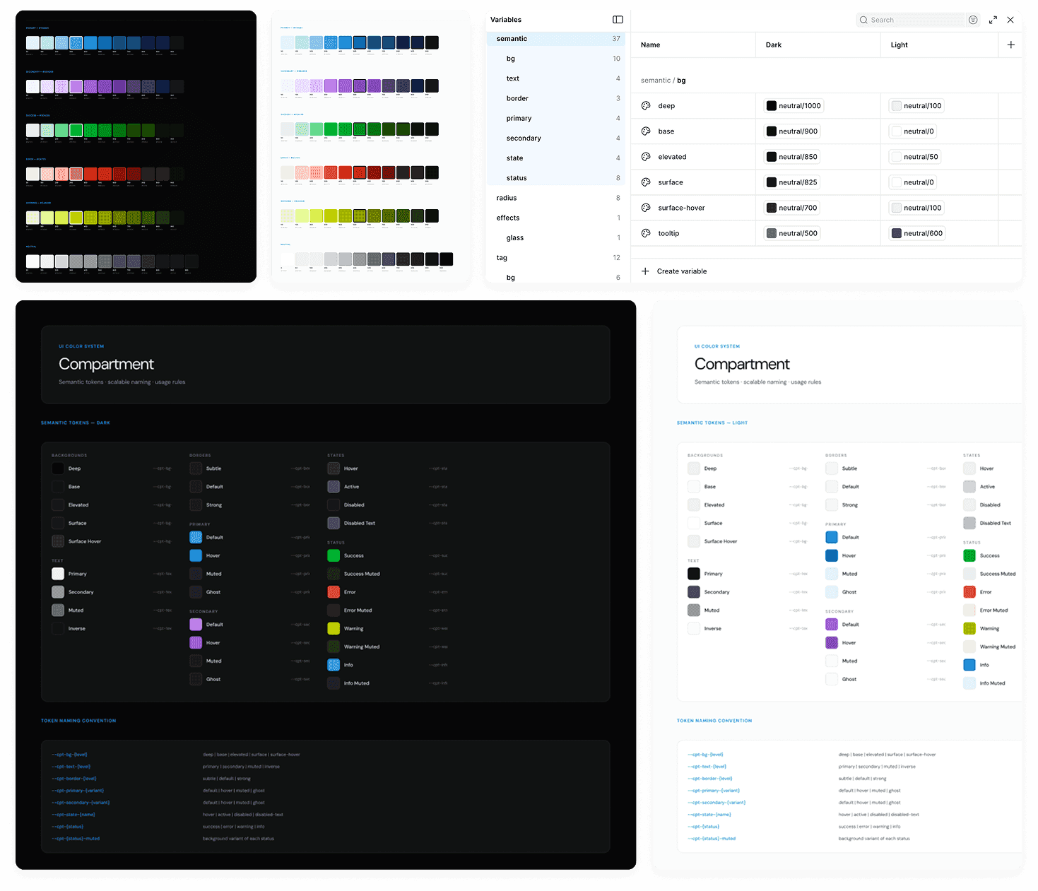
I started where everything secretly hangs together - the brand. Positioning, audience, value prop, tone of voice, the whole vibe. Then came the unglamorous magic trick: turn all of that into tokens (colors that grew into a full palette, a type scale, semantic naming) and let Codex - steered by a very opinionated AGENTS.md - translate those tokens into real production code. No "designer throws a Figma over the wall, dev quietly cries" handoff: it went Figma → Git directly. Out the other side: a reusable component system, two themes (token-driven, so switching them is one variable, not a rebuild), and a bit of WebGL motion because, well, why not.
Speed exposed what was missing
Here's the underrated thing about shipping fast: it quietly murders the comforting lie that "more polish will fix it." On a one-week clock, weak positioning has nowhere to hide. Hero copy won't write itself? The promise isn't sharp enough. Page structure turning into spaghetti? The product story is still too broad. CTA sounds like every other CTA on the internet? The value prop isn't specific yet. The page basically becomes a lie detector for how well you actually understand the product.

For a technical audience, structure does the heavy lifting
Developers are a tough crowd - they scan for proof, constraints, compatibility, and any hint that you actually get their stack. Pretty brand words bounce right off. So the structure has to earn its keep: lead with the promise, describe the problem in their words (not yours), show the workflow so the mental model clicks, then kill the uncertainty and hand over an obvious next step. Decoration is optional here; this part isn't.

Implementation-ready, not just a concept
The brief in my head was never "make a pretty concept deck." It was "make pages that can walk straight into the codebase without a chaperone." So every decision had to be real: layouts that survive contact with actual content, reusable components, modular blocks, responsive behavior that isn't an afterthought, and a visual direction built to grow with the product instead of aging out by launch day. That mindset stuck with me - design shouldn't stop at "here's the intent," it should pave the road to implementation.

Why this lives as an article now
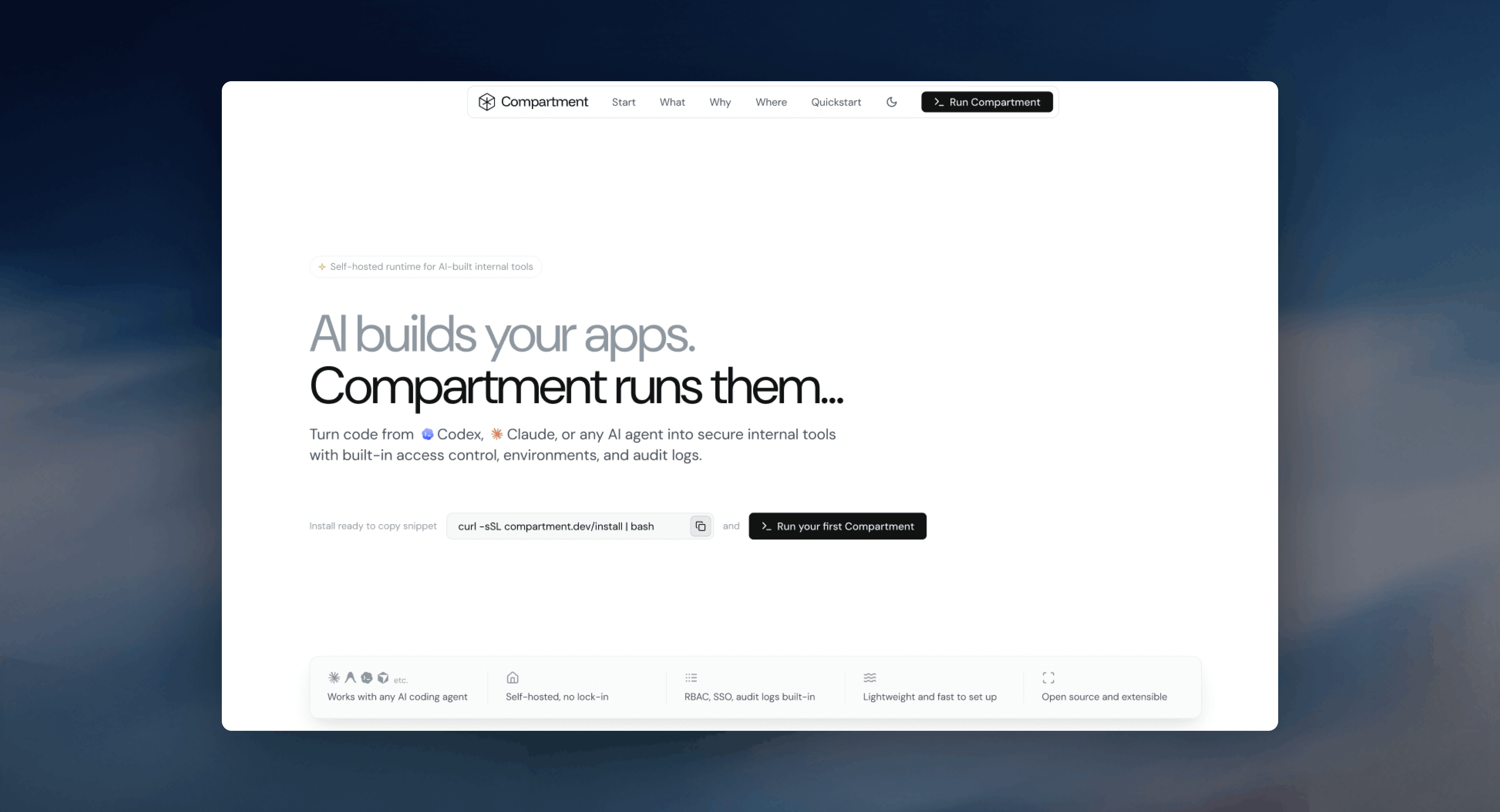
Websites age like milk. Visuals shift, messaging changes, the product moves on, and yesterday's "final" page turns into a little museum piece. The thinking, though, ages a lot better: how a fast sprint exposes positioning gaps, how structure untangles a technical product, how implementation constraints quietly make the design better. So instead of dressing this up as a deeper case study than it was, I'm keeping it honest - a short article that earned its place by pointing at the bigger product work it set up.
Hover
Technical products need systems of explanation
Every technical product needs a few translators. A landing page explains it to the outside world. A console explains it operationally. A design system explains how it's built. The website was just the first compression layer - "explain this to developers, fast" - and it quietly set up the harder, deeper work on the product console and the design-ops foundation. What I'm taking with me: speed, positioning, structure, implementation-ready design, and the hardest currency of all - developer trust.